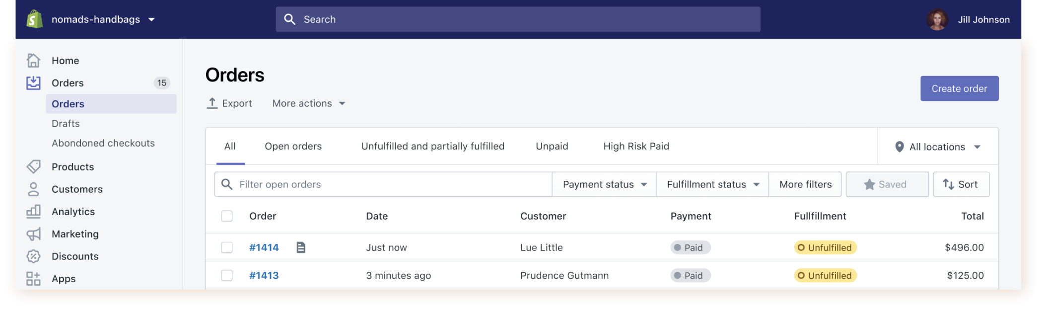
Shopify’s list of orders is the most visited page by a wide margin, and for a B2B product, that’s not necessarily a good thing. We’re not going to win awards for high engagement and clicks — we want people to spend the least amount of time possible to achieve their goals.
Unfortunately, the page wasn’t very efficient, and had low adoption for key workflows like bulk shipping. The problem was simple: people didn’t have the information needed to make decisions on the list, so they needed to visit every order one by one to act.
The original design was the result of discovering patterns in what most businesses found necessary (like customer name and the order’s total). However, what was necessary wasn’t sufficient for any one business or user to work more efficiently because each had slightly different information needs.
The goal
Our attempts to build for the common traits across all businesses was actually working against the customer service agents, warehouse staff, makers, and small business owners who each had different information requirements of the orders page.
Our goal was to allow the right information to be surfaced, reduce the views of the orders list, reduce the amount of page views to individual order pages, all while maintaining or improving the number of key workflows like shipping happening on orders.
Our team
Role: researcher and designer
Team: two staff designers, one developer
Timeline
We conducted a week-long design sprint with 2 staff designers, a front end developer, and product manager. During the sprint, we conducted concept and usability tests using Figma, and later code prototypes with real user data.
The entire project team, including data science, analyzed the feature’s rollout collaboratively. In total, it took 4 months from the initial design workshop to shipping.
Challenges
Internal fear of impacting users
Redesigning the most visited page in a B2B product (2 million individual users per month) is intimidating. The orders index hadn’t changed in over 6 years, and the orders team fumbled the launch of a redesign to individual order pages had left the team uncertain about making changes. I helped team morale and confidence by running concept tests to produce stronger, better informed ideas.
Using fake data for tests
During the initial design sprint, a challenge we repeatedly faced with Figma prototypes surfaced: if we were trying to understand decision making, and we believe that information was used differently from one business to another, then we need real data. Real data would
help users connect with the words on the screen, and give us a better idea of how information may impact their behaviour.
Fortunately, we were able to come to a prototyping solution that could capture real data from a user’s store when testing. This wasn’t production code, but it was incredibly impactful. Participants were able to make decisions on how they’d ship based on product name, which helped them understand the weight and dimensions of the order, like a shirt being simpler to package than a chair.
Designing for the “average” user
Some companies didn’t offer different shipping methods, or sold only one product, so displaying that information cluttered their experience. Getting stakeholders to buy in to the need for it was difficult, and due to COVID, we had to cut personalization from the project and settle on static columns. Update: customization was implemented after my departure in 2023!
An unexpected usability problem: displaying time
The most surprising problem was how we displayed time. The Shopify Polaris design system’s guidelines used a mix of relative and absolute time. Times closer to the present are relative (2 minutes ago), times more than 24 hours are hours are a mix of absolute (Yesterday at 8 pm), and further than that they become fully absolute (Dec 1 at 8 pm). This proved to be unhelpful for use cases where exact times matter, like cutoffs for same-day shipping. We also noticed that the page wasn’t frequently refreshed, and since relative time wasn’t updated, it was only accurate for a minute. We updated the page to always display absolute time.
Launching early for COVID
Alongside this project, I was researching the impact of COVID on merchants starting in February of 2020. I observed an increase in orders but a decrease in the number of user logging into Shopify. Social distancing measures led to fewer staff available to ship orders, while the lockdown caused a surge in online purchases.
Our team decided to prioritize shipping a beneficial solution to our merchants quickly, rather than keeping the ideal scope and perfecting it. We launched a smaller redesign focusing on changes that were most beneficial to beta users, such as displaying shipping method and purchased products.
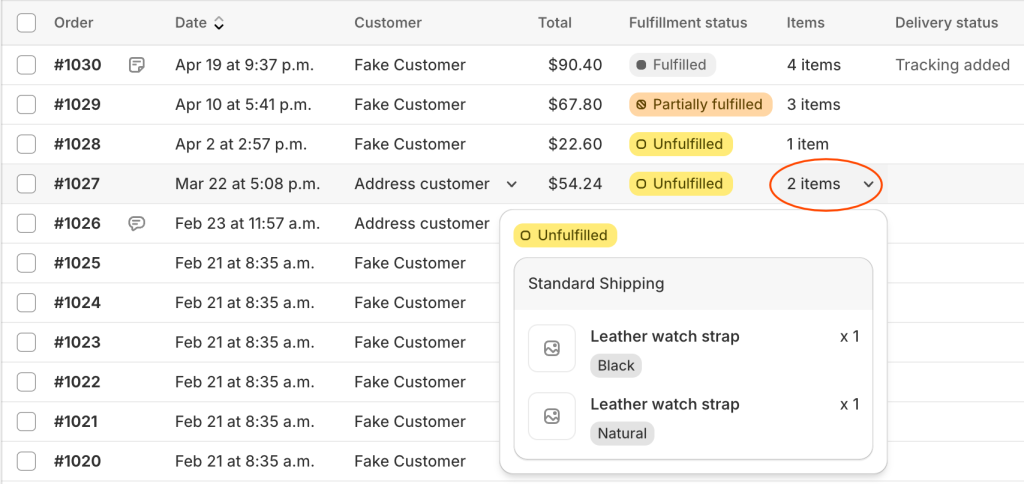
“Peeks” are one example of a component added by this project to Shopify’s design system. We found that products informed decisions such as packaging requirements and prioritization. Clicking on a cell made details available on the orders list and saved them from having to navigate into each order, allowing more work to happen in bulk.
Impact
In April of 2020, released an update to 15% of the merchants on Shopify and measured the impact for three weeks, looking out for a single key metric: a reduction of pageviews to the individual order pages, with no negative impact to the completion of order workflows. This was a sign that more companies were doing work through the orders list itself: using the shipping method or the items in the order to make informed decisions.
Releasing something smaller proved to be the right call. Working with data science, we determine that the smaller redesign resulted in a 10% reduction in page views required to start an order edit or shipment workflow, which, added up across all of Shopify, resulted in a year of time savings in just 3 weeks compared to our control group.