
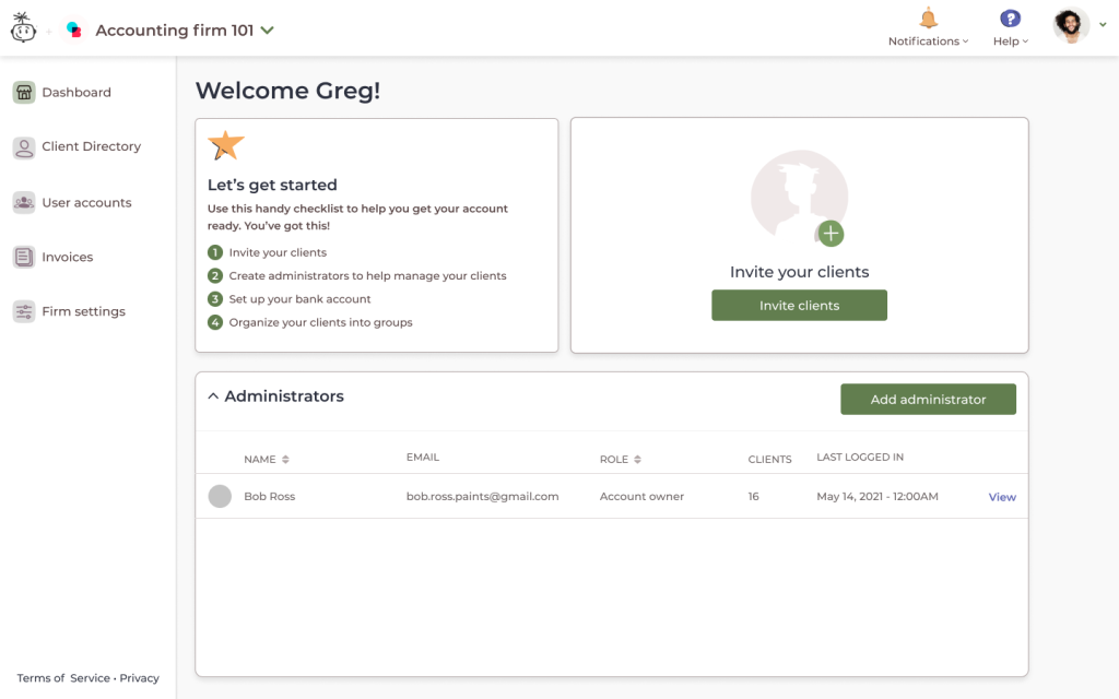
I joined Wagepoint in early 2022 to lead their design team, which had been without leadership for 2 years. They were building a major new product with multiple surfaces (a dashboard for accountants, a payroll product, an employee portal, and an internal tool to manage payroll for Wagepoint’s finance specialists), and were falling behind schedule for the big launch.
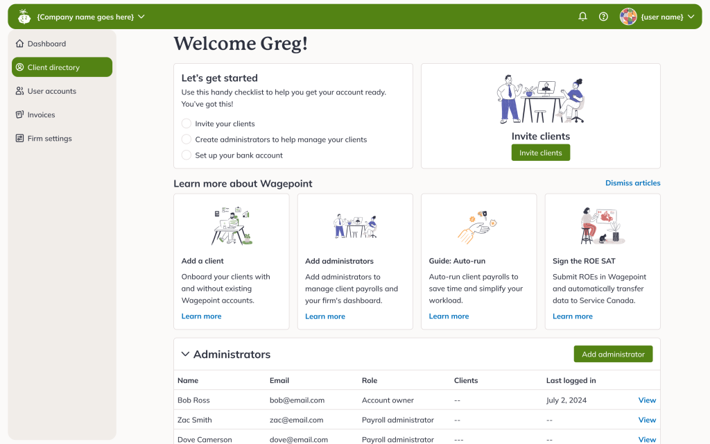
Early on, I lead the team’s efforts to re-design the look of the app, which was dated even before launch.
As we got closer to launch in late 2023, I noticed a more significant problem. Our deployment times hadn’t been speeding up as we got closer to release. This would’ve been a major issue after our product was in the hands of our accountants and small business owners. Having launched multiple features in the past, I know we hadn’t gotten everything right, and we were going to need to be able to move quickly.
I designed a simple solution to a new onboarding flow that cut deployment times dramatically. This resulted in us being able to quickly react to bugs and usability issues during the launch of our flagship product.
The problem
At Wagepoint, each deployment was delayed due to extensive testing needed for the payroll product’s onboarding process.
The onboarding flow was built using different components than the rest of the app, over time deviating from the pages it was based on and becoming a large testing & UX burden. The team was losing track of the differences between the two versions of pages (e.g. adding an employee in onboarding wouldn’t display certain fields fields).
This resulted in 7 additional hours to test onboarding for every deployment.
There was only 1 month until launch. Knowing that onboarding would be the most scrutinized product area once we had people using the product, I knew we needed to speed up our ability to iterate.
The root cause
As UX Manager, I needed to understand how we got to our current state, so we could fix our process going forward.
- Design didn’t solicit engineering feedback
- Engineering didn’t raise technical hurdles
A new process was put in place (read about it here) to ensure teams collaborate and fully understand the impact of their decisions before development.
Optimal solution with minimal effort
The old onboarding flow, which consisted of pages in a linear wizard that were almost duplicates of existing pages. This resulted in thousands of lines of duplicate code, with inconsistencies that nobody in the team could keep track of.
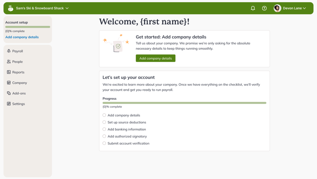
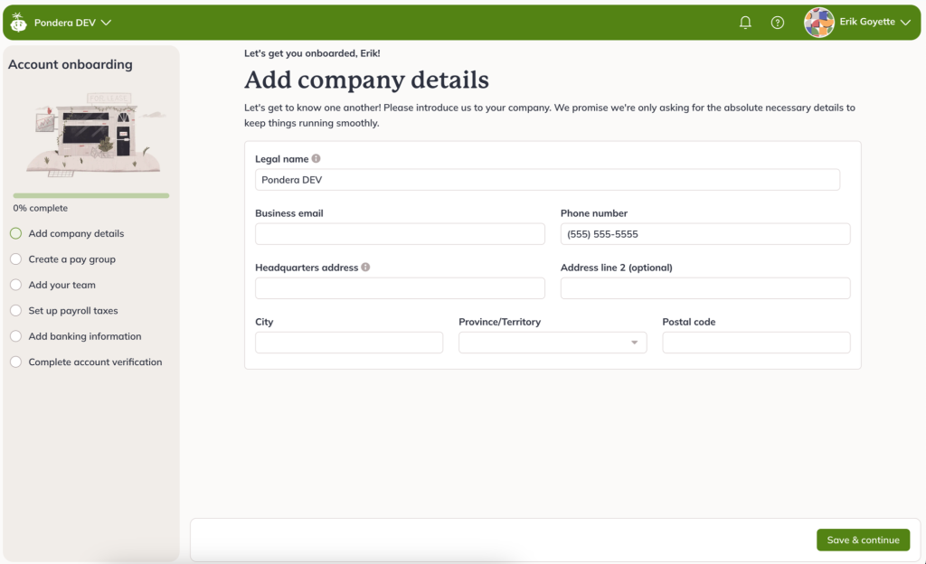
To keep within the tight timelines, I devised an approach that would only require one new screen. This “Account setup” page would link out to existing areas of the app to complete the step. A tracker at the top left would help people keep tabs on their progress, and guide them to the next recommended step. Not only did this allow us to focus on quality and reduce development effort, but it also let people establish their understanding of the app’s navigation.
Challenges
New issues discovered
By focusing our testing efforts, we found issues and missed use cases in existing workflows. Much of the app assumed that a single person would finish setup by themselves, which we knew was false (an accountant and a client often would work on setting up a company together).
Implementing daily check-ins across timezones
After sharing the problem and the constraints with the team, we had to grow our collaboration muscle. Getting the teams acquainted, adjusting the design team’s hours (a world-wide remote company means early mornings for North America!) to allow for more collaboration took a bit of effort, but paid off immensely for future projects.
Impact
The project launched on time, and our new onboarding not only provided a consistent experience to our users, but also let us confidently ship and iterate faster.
Many issues after launch were resolved within hours or days. These would have taken weeks to ship due to the regression testing and duplicated development effort caused by the onboarding workflow’s old approach.
Some examples of what we were able to fix quickly:
- When our banking verification partner lost support for a major Canadian bank, we were able to unblock 20% of new trials with a custom verification method.
- Through some reports I created, we noticed an unusual amount of time spent setting up a pay frequency. We implemented content updates, resulting in a reduction in time spent, and increase in completion rate within hours of discovering the problem.
- Accounting partners couldn’t get their clients to accept their invites, so we updated the workflow to allow accountants to log in and immediately begin setting up their clients’ accounts with only a day of development.
Wagepoint’s conversion rate quickly grew for direct small businesses from 25% on the first week of launch to a healthy 37% after two months (fixing usability issues and bugs we hadn’t identified before). Accounting clients reached 90% (from 68%).
Key learnings
At Shopify, I took ownership and collaboration between design and development for granted. My early days at Wagepoint taught me how crucial those relationships are, and how to build them within teams that need a little push to get it started. This is especially true in remote teams, where organic and spontaneous conversations are a lot less likely to happen.
The project also helped me create a long term strategy to use design to simplify the app. Our team was small and scrappy, but we’d struggle to maintain an app as complex, broad, and compliance-heavy as payroll at a high level of design and technical quality.
Though it may hurt to reduce scope, the most important thing is making sure you’re doing the job the people who hired your product to do as perfectly as you can.